Reverse Engineer a Sponsored Post

What are the ad’s strengths?

While I was scrolling through Instagram, the “Go Places” title caught my eye. It uses a nice script font with a soft blue and purple watercolor purple. It is very pleasing to the eye. It’s difficult to tell in this screenshot but the add is actually a video. The video cycles through 6 photos. Each photo shows happy people traveling in cool places. I thought that this was creative because it felt like I was looking through a scrapbook or a postcard. I stopped on the video because I enjoyed looking at each of the photographs and seeing where the people had traveled. I especially like this ad because I don’t feel forced to act on something but rather, I feel intrigued to click because I want to “go places” and “do what [I] love.”

What are the ad’s weaknesses?

I think that the text could be arranged differently because it all feels too clumped together and makes it a little bit difficult to read. The Go Places Sweepstakes is in a nice place but they could have moved the other words below the picture, or spaced it all out better.

What is the ad trying to accomplish with its design?

The main purpose of this ad is to get people to click on the Learn More button to take them to their website. When you click on the learn more button, it gives you information about the sweepstakes. I think that the end goal is to get people to wander over to their online store and buy something.

How has the design used: CompositionFundamentalsContrastLinesLayoutGolden SectionRule of ThirdsNot HalfSwiss Grid or Custom Grids?

This ad uses lines to display its content. Content is divided into three sections with implied lines. The design could use more white space but I think it does a good job of serving its purpose of getting people to click on the learn more button.

What metrics (likes, shares, re-tweets, etc.) will be used to determine if the ad is successful?

This ad could use likes to determine if the ad was successful. There are currently 953 likes and 12,489 views. They could also use analytics to see how many times the learn more button was clicked and directed to their website.

Reverse Engineer a Social Video

This video was a sponsored ad posted by Paper + Oats that I found on my Facebook page while watching videos. It does a comparison of the speed of creating a document in Photoshop vs. InDesign.

What are the video’s strengths?

They say that people decide if they will watch a video within the first 8 seconds. As a frequent user of Photoshop and InDesign, I was drawn to the video within the first few seconds because it says “Gotta question for ya.” then proceeds with “which is better to design this 2-page PDF? Photoshop or InDesign?” The beginning grabbed my attention because I wanted to know what the question was going to be. As soon as I saw the word design, I was interested. The color scheme also happens to be one of my favorite color combinations so I felt obligated to watch the first bit of it.

I really liked the side-by-side comparison of the two programs with the titles and speed at the bottom of the screen. It was fun to watch the progress of the document on a time lapse. There is even a little bit of humor in the video when it shows the lady already printing the InDesign document and relaxing while the Photoshop document is still being designed.

What are the video’s weaknesses?

I had to mute the video almost immediately because I didn’t like the song. This is just an opinion, but the polka-folk fusion music didn’t fit the feel of the video. I had a hard time viewing this video on my mobile device because the screens were so small. I could hardly read or see what was being done in the programs which defeated the purpose of the ad. The video was also very long. I admittedly skipped through the middle portion the first time I watched it because I quickly got bored. The action was placed at the end which made it feel like a native ad, however the video was so long that I’m sure a lot of people didn’t make it to the end.

What is the video trying to accomplish with its design?

The video was trying to show that InDesign is the better program for designing things like documents. In the end they were trying to promote a tool or guide on how to use InDesign. I think they accomplished this goal by showing the two screens side by side. It is easy to tell that there are fewer steps to go through when designing something on InDesign. I especially like that the screen is split in the middle and one program doesn’t dominate over the other.

How has the design used: CompositionFundamentalsContrastLinesLayoutGolden SectionRule of ThirdsNot HalfSwiss Grid or Custom Grids?

The beginning screen used a great layout because there is a lot of white space that directs your eye straight to the question in the center.

It also used this custom grid throughout the video with equal amounts of padding around the outside. This example splits the grid in half with an image on one side, and the text on the other side. The majority of the video shows the screen split in half while contrasting the two programs.


What metrics (likes, shares, re-tweets, etc.) will be used to determine if the video is successful?

The ad is promoting a program on their website so they will want to know how many clicks the ad got to their website to determine if it was successful or not. They could also use the number of likes to see if people enjoyed the video or not.

Reverse Engineer – Article Promotion

While scrolling through Instagram, I had a sponsored ad pop up that was visually appealing and had an interesting caption. The ad was for the website signature-reads.com. This was the sponsored ad that I saw:

sponsored instagram ad for signature-reads.com

The caption says “11 Essential Pieces of Advice for Writing Your Memoir. Read the tips you need to finally start writing your memoir. What story do you want to tell?”

What are the ad’s strengths?

This ad does a great job of grabbing my attention because it uses a photo that is interesting to look at, has great contrast, and is different than normal ads. The caption shows the purpose of the ad is to direct you to their website to download/view the 11 Essential Pieces of Advice for Writing Your Memoir. Many people enjoy reading lists because they are easy to scan. Seeing that the article is a list leads the user to click on the download button which will then take them to the page shown below. In order to view the whole article, they ask for an email.

What are the ad’s weaknesses?

While the photo is really interesting and a good design, I’m not quite sure what butterflies have to do with writing a personal memoir. The two seem unrelated to me. The only hint that I get of their purpose is that it says “Guide to Memoir Writing” on the image itself.

What is the ad trying to accomplish with its design?

The ad is trying to draw in people with a nice looking photo. They want the user to be interested enough to click on the photo and download the article by giving them their email. This email could eventually be used to sign up for a newsletter.

What design techniques did the ad use?

This design uses contrast in a very successful way. The colors of the butterflies against the light grey background stand out especially since the Instagram app has a white background. The images of the butterflies are also sharp and focused against the white space. The design uses the rule of thirds with the text. The text is placed on the middle right hand side and aligns with the middle row of butterflies. The butterflies are interesting because they don’t follow the rule of thirds and some of the butterflies are even cut off the design. This was intentional and is actually successful at creating their own custom grid within the rule of thirds grid. It makes the post feel creative and attracts the artful eye.

What metrics (likes, shares, re-tweets, etc.) will be used to determine if the ad is successful?

This ad will use likes to determine if it was successful. The ad already has over 1,000 likes. The ad could also use Instagram analytics to see if the user clicked on the ad and was directed to the website. Their main goal in posting this ad is to have people register their email and sign up for the newsletter so they could look at how many people registered their email during the time that the advertisement was posted.

Reverse Engineer – Anthropologie

This week we were asked to reverse engineer a social media brand that designs their content well on social media platforms. I chose Anthropologie because I have followed this brand on Instagram for a few years now and really like the content that they post. I will explain some of the reasons why in this post.

What are the brand design strengths?

Anthropologie has done a wonderful job of posting content that has a similar style. That style is mostly warm, soft, feminine colors with bold colors as the focus of the image. During a season, they will often stick to one bold color to feature in each photograph. The things that they post feel more like fashion and photography inspiration than an intrusive advertisement. The brands strength stems from the fact that they draw in a community of travelers, photographers, and designers first instead of enticing people with commercials and advertisements.

What are the brand design weaknesses?

It was difficult for me to determine any weaknesses in the design because the content that they post is very high quality. One thing I did notice however is that it isn’t always easy to see what product they are trying to advertise. Another item will be the main focus or there are sometimes too many items in the photo.

What is the brand trying to accomplish with its design?

I think that the main goal of the content posted by Anthropologie is not just to sell their products but to create an entire lifestyle for the Anthropologie community with their products. They accomplish this sense of community well by selecting posts from customers that are tasteful and match the style of the brand, then repost it on the Anthropologie Instagram page.

How has the design used…

Composition:

Although many of the photographs appear to be natural and in the moment, a lot of the photos have an intentional composition. This one shows movement by her pretending to blow out the candles. And the flames show movement as well. This is totally natural, right?

Fundamentals:

While Anthropologie often breaks the rules, there are often photos that show the fundamentals or simplicity of a photo. This photo is centered and shows most of her body.

Contrast:

As I mentioned earlier, one of this brand’s strengths is that they will often use a highlight color, according to the season, to contrast the other softer colors. This winter’s color is a bright red-orange color and is featured in several of their Instagram images.

Lines:

This brand creates lines sometimes by lining up similar items or posing the body in certain ways to create a line extension. This is also shown in the previous example where the legs show a horizontal line.

Layout:

This example of layout shows how you can lay items out diagonally rather than just vertically or horizontally.

Golden Section:

This layout is sometimes difficult to notice but I think this is a pretty good example of “off-centered hierarchical flow” (Contentdesigned.com).


Rule of Thirds:

The posts on both Instagram and Facebook pay close attention to using the rule of thirds. The compose the main subject to usually be placed on the right.


What metrics will be used to determine if the brand has been successful?

Likes are the best way on Instagram and Facebook to determine if a specific post from the brand has been successful. To determine if the brand as a whole is successful on Instagram, I think the number of followers determines that success. Anthropologie currently has 3.2 Million followers.


Reverse Engineer – IntuitTurbo

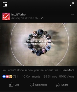
While browsing through the wonderful, never ending, time consuming stream of videos on Facebook, this ad for IntuitTurbo caught my attention.

IntuitTurbo Facebook ad

What is the main purpose of the ad?

The main purpose of this ad is to help the viewer see that everyone has financial struggles and that it is okay to talk about it and learn about those financial problems with others. The main goal is to get the user to click on the “learn more” button on Facebook which then directs them to IntuitTurbo’s website. On this website it shows the viewer all of the services provided through TurboTax to get your credit score and see how a lender views your financial status. In the end, this video is intended to lead you to sign up to get your credit score and other important financial information.

What is this ad’s strengths?

This ad does a great job of getting the viewer to think of their own financial standing as they watch this video. There are many, if not all, questions that the viewer can relate to and see that others are dealing with the same problems as well. Each person in the video is at a different stage in their life. At the end of the video, you see all of the people come together in the small circle which helps the viewer to see that we are all pretty much in the same standing when it comes to knowledge and stresses about finances. This ad does a great job of making the viewer connect.

What is this ad’s weaknesses?

I didn’t really understand what IntuitTurbo was trying to sell to me or get me to do until the very last second of the video. I’m not sure if this is a kind of strategy to get the viewer to watch the whole thing, but I like knowing what I am in for if I am going to invest a whole 1 minute and 31 seconds of my precious time into an ad, when I could be watching videos about cats and dogs. The purpose of “see where you truly stand” placed at the end seemed vague and I wouldn’t have clicked on it unless I was doing this analysis.

What is the ad trying to accomplish with its design?

As I mentioned previously, the ad is trying to connect with the viewer. It causes them to think about what their standing is financially and that they aren’t alone in this difficult journey. It also doesn’t feel like an ad at first which enticed me to watch the whole video. In my opinion, this was their greatest strength.

What metrics will be used to determine if the ad is successful?

The metrics used to determine if the ad is successful could be based on the number of likes and shares that the post receives. In a week, the video has been viewed 510K times, with 737 reactions, and shared 200 times. Compared to other advertisements that I have seen, the number of shares seems like a lot. The reactions are also fairly positive (no angry reactions) which isn’t something that I always see on ads placed on Facebook. However, the best determining factor of success would be to see how many users clicked to “Learn More” about the video. I’m not sure if this is a feature that is recorded on Facebook.

My Personal Manifesto

Find Balance

In order to find a balance in my life, I first need to find the things in my life that take up time and sort them based on their importance. Part of finding this balance means eliminating the things that are least important to me. The things with the greatest importance are the ones that improve my life in some capacity. I have struggled with many different mental health issues throughout my life. The best way for me to cope with it all is to take the time to meditate and find peace. In order to find some sort of balance in my life, I will use this class as a way to discover methods on how to become mindful. Through social media, I will share my resources.

Help Others

I want to create an account on different platforms to share the things I discover on my path to finding balance in my life. I have decided to name this Rest and Be Mindful which is a play on words from the quote “Rest and be thankful”by William Wordsworth. With this account I plan to help others who are going through similar problems as I am by posting material that can teach them how to handle mental health and the general stresses of life. I plan to share quotes, mindfulness exercises, tips, and provide a space where people can connect and share their experiences as well. I have been looking for a way to serve others that are struggling with the same things that I deal with. This is just something small that I can do to accomplish that desire.

Be Consistent

Consistency is one of my greatest weaknesses. I have a strong desire to change that into a strength. With social media, it is important to be consistent with the things that are posted. I know that if I am consistent, the people who follow my account will feel like they can depend on me and trust in me.

#BringBackTheBees Campaign Analysis


website banner of bringbackthebees.ca
The website banner of bringbackthebees.ca.

Where Did Buzz Go?

During the year 2017, you may have noticed something peculiar about your normal box of General Mills Honey Nut Cheerios. The iconic bee named Buzz was missing! No, this was not a printing mistake or graphic design error. In fact, it was a rather clever way to gain followers, new customers and of course, save the dwindling bee population.

General Mills started a successful social media campaign that raised awareness about the declining bee population. If we don’t act now, many precious foods like Honey Nut Cheerios, apples, almonds, and countless other foods will no longer be available for us to eat. The image of Buzz the bee disappearing helps people to stop and think about a world without bees.

A packet of wildflower seeds

Not only did General Mills capture the attention of the United States and Canada, they provided a way to act on the problem. They partnered with Veseys, a large company that produces many different types of seeds for planting. They first set a goal in Canada to plant 100 million wildflower seeds. To do this, packets of seeds were attached to every Honey Nut Cheerios box. Canada exceeded their goal by 4 times. In the U.S., you could sign up to receive a free packet of seeds in the mail. The U.S. had a goal of giving away 100 million wildflower seeds. In the end, they gave away 1.5 billion seeds. They exceeded their goal by 10 times! That’s a lot of seeds.

How were they so successful?

Honey Nut Cheerios spread the word about this campaign through several social media platforms including Facebook, Instagram, Twitter, and Youtube. Advertisements, articles, and videos were seen all over the internet for a period of time. Check out this short video that makes you feel a need to save all of the bees.

Honey Nut Cheerios’ Principles of Success

Value Principle: This campaign made people feel like they were a part of something bigger and better. They helped people to understand there was an actual problem and that by planting wildflowers, they were helping to save the bee population and the planet.

Principle of Least Resistance: In order to save the bee population, all they had to do was either buy a box of Honey Nut Cheerios or enter their address on their website to receive a packet of seeds in the mail. It was so easy that they even persuaded me to do it and I received the wildflower seeds in the mail shortly after.

Zeitgeist Principle: In their 30 second video, they set the tone of having faith in humanity restored. This phrase is used often by people in this generation when they see videos of people doing good things. By showing clips of others saving animals, it helps them to think “oh, I could do that too by planting seeds!” The phrase “helping is in our nature” also does a great job of reaching out to a vast audience.

Attention Principle: The hashtag #BringBackTheBees allowed those who received their seeds to show their friends and family that they contributed to saving the bees. It’s in human nature to do something good and want to be recognized for it. In fact, this is one of the most rewarding things in life. Many people shared photos of themselves planting their seeds and seeing them grow.

Screenshot of an instagram post of a flower

Story Principle: Having Buzz the Bee disappear helped to create a story of what could be like if all of the bees were gone. They also put out a great video that helped to imagine a story in the future of what it would be like without honeybees. These types of story help to put the situation into perspective.


Here is an article that explains what didn’t go so well with the campaign after it had all happened.

Week 13 Reflection (B250)

Well, we have arrived at the end of the semester. This semester went by very quickly but I feel that I have learned so much in that short time. I know that I will carry the skills that I have learned into my future careers and they will be an asset to my resume and skill set.

This week we learned more about link building for our website. Link building is how you network with other companies to boost your SEO ranking and create more traffic to your website. There are many different methods to build links that direct to your site. Adding links on all social media platforms is a good way to start although this method won’t increase your SEO ranking. To increase SEO ranking, you can also comment on other blogs and websites with a link back to your website. Another great method is offering a service to another website, such as writing a review or article, and having them place a link to your site in return. There are many out there who need to link build but don’t know who to network with so asking around through email, or phone call is a good method to begin.

Here are some links about ideas on how to begin link building:
http://www.searchengineguide.com/stone-reuning/a-brief-intro-to-link-building-for-small.php

https://www.searchenginegenie.com/advanced-link-building-strategies.html

https://www.searchenginejournal.com/link-building-strategies-checklist/17256/


Link building can also be a difficult task so it is best to set goals before you begin. Here are some questions to get started:

Map Out Your Strategy

  1. Who and when?
  2. What and how?
  3. Where will the links be gathered?

Here is my plan that I have created for this website.

1. Who and When?

I will be the one that is doing the work of finding places that I can place links to my website. I want to increase my score on woorank.com, so I will begin searching for places this week and hopefully will have at least 2 reliable websites with a link back to my site by next Tuesday.

2. What and How?

I will mostly be focusing on gathering links from blogs and websites of friends. Some of the keywords that I will be using are “handmade jewelry” “boho chic jewelry” and related terms without all of them being too similar.

3. Where will the links be gathered?

Boho and Basil Etsy Page (the jewelry business)

My personal blog

My friend’s blog

Facebook

Instagram

Week 12 Reflection (B250)

I can’t believe this semester is already almost over! I have learned even more than I thought I would at the beginning of the semester. This week we learned about SEO and social media. The big question or overall theme of the week was how can we use social media to increase the amount of followers or customers that we get?

The first topic we discussed was how we can optimize social media to get more traffic to our webpage. I really liked this article about the 4 steps we can implement for social media.
http://www.toprankblog.com/2010/07/4-social-seo-success/

The four steps are:
1. Listening
2. Content
3. Socialize
4. Measure

One of the biggest steps that I feel I need to implement is content. I don’t have enough content on my webpage for my page to be found through the words that I use. This is where a blog can be very beneficial to the webpage because it directs others to the page through the keywords that are used on my site. Using specific keywords throughout my blog allows others to find my website through searches.

Another important step and one goal that I have over the next few months is to socialize. My website already has both Instagram and Facebook accounts but I need to take the time to use those accounts to build up the characteristics of the brand and gain trust through the things that I post, share, like, and comment on. Those four actions are essential to gaining followers.

Here is another article that helped me:
http://www.socialmediaexaminer.com/7-steps-for-a-successful-social-media-strategy/

Overall, this week has mostly shown me the things that I need to improve on in order for my website to be successful. I haven’t had a purchase on my actual website yet (there have been purchases on the Etsy page) and I feel the reason why is because I haven’t been using social media to gain the traffic that I need.

Week 11 Reflection (B250)

Along with the week that we actually designed our webpage, this week was one of my favorite weeks because we learned how to assess the landing page that is placed in our advertisements. Using the statistics given in Google Adwords, we can evaluate what needs to be changed in order to bring more views and purchases.

In order for a landing page to be successful, it is important to ask if the landing page shows what is promised in the advertisement. If someone clicks on the ad and doesn’t see what they are looking for easily, then they will leave the page quickly. This is known as the bounce rate. A landing page needs to be visually appealing, but also needs to be usable by the viewer.

Here are a few articles that I used to help evaluate my own landing page:
https://support.google.com/partners/answer/2404197?hl=en
https://moz.com/blog/6-essential-ppc-landing-page-optimizations

The next thing we learned about was the basics of Search Engine Optimization (SEO). Before this week, I didn’t really understand exactly what SEO was, or how to implement it. This video really helped me to understand what it is and what changes can be made to my webpage to increase traffic:
https://www.youtube.com/watch?v=hF515-0Tduk&feature=youtu.be

While learning about SEO and creating a successful landing page, I was able to come up with a few things that could be changed in order to make my website better. I used this article to base my answers off of:
https://moz.com/blog/visual-guide-to-keyword-targeting-onpage-optimization (The first graphic is very helpful!)

1. Text, images, and multimedia are remarkable: My images are not the best right now because they are temporary images that my friend who makes the jewelry for the company took on her phone. This is one of the most important things that I need to update because it makes the page seem less appealing.

2. The page loads quickly: It takes a lot longer for the first image that appears on the homepage to load than the rest of the content because it is such a large file. I need to either resize the file or choose a different image that will work better for the page.

3. Primary keyword phrase is the first words of the title element: I don’t know what the title of my webpage is right now. I need to figure out how to use HTML to change the title for my site however, I don’t think that Wix allows me to do this. I will need to find an alternative way so that search engines can read my sites title and show up in search results.

4. Mobile friendly: My website takes longer to load on a mobile device and the content isn’t arranged the way that I want it to be. I need to take the time to make my website mobile friendly especially because all of the people who have clicked on my link have come from a mobile device.

5. Primary keyword is found in the body content two times: I don’t have much body content on my page right now but I know that I need to add content so that my website will appear more in search engines.